The inlay work of Gaspar Homar
ESTER COBLES PÉREZ and SOL URBANO MORALES
The late nineteenth century was a period of sharp socioeconomic contrasts, emerging due to the process of industrialization in cities. In Barcelona, this process, along with the return of wealthy capitalists because of the Cuban crisis, created an economic boom. The flow of capital was now controlled by the incipient bourgeoisie, who began to settle in the centre of Barcelona and were well established by the beginning of the twentieth century. The growth of the industrial bourgeoisie was mirrored by a similar growth of the proletariat. The streets of Barcelona became the scenes of the class struggle and echoed new ideologies (Marxism and Communism). The middle class took refuge in their homes, and did everything they could to avoid conflict. A concern for decoration and wellbeing in the home generated new art markets and the bourgeoisie thus became the driving force behind Modernista art patronage.
The social changes at the turn of the century obviously did not take place in isolation. The perception of art was also adapted to the new precepts of industrialization. “Art for Art’s Sake” became an almost extinct concept (at least in the most underprivileged social classes), giving way to utilitarian design. At the same time, the Modernista decorative movement gathered momentum in the highest echelons of society. New art broke with established aesthetic conventions and threw off the shackles of the past. Curved shapes inspired on nature appeared in architecture: in doors and windows, ceilings, staircases and cornices, and they entered houses in all kinds of furniture: wrought iron lights, tapestries, the backgrounds of paintings, and even in clothes. The artistic liberation representative of Art Nouveau (or Modernisme if we’re talking about Catalonia) was, in short, the symptom of the changes in the people who appreciated art, which in turn was addressed to two very different kinds of consumer, so much so that we see two very contrasting trends with regard to the conceptual lines of furniture. On the one hand, there was a practical and functional side that included furniture in the Thonet style, with curved wood and a simple manufacturing process that made use of mass-production. On the contrary, furniture destined for the middle-class dwelling was less lightweight: it was made of solid wood, usually decorated, and it required a craftsman’s skill to make it.
Modernisme in Catalonia left a praiseworthy architectural legacy and even more contributions in the world of the decorative arts. The idea of the total work of art, so typical of Modernisme, was reflected in the composition of the team of craftsmen. The multiple facets of the applied arts came together to develop projects with the same conceptual line from beginning to end, down to the tiniest detail. The workshop of Francesc Vidal in Barcelona stands out precisely because it brought together the finest craftsmen and artists of the day in the same place; they included one of the most highly reputed cabinetmakers, furniture makers, and ensembliers of Modernisme: Gaspar Homar i Mezquida.
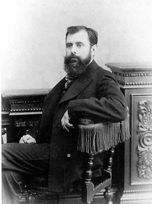
Gaspar Homar came from a humble family. He was born in a small village in Mallorca called Bunyola, and he moved to Barcelona in 1893, aged just 13. There he studied decorative painting, fabrics and embroidery at the Llotja school. During his time at the Vidal workshops he concentrated on cabinetmaking and furniture design. Woodcarving took precedence over inlay work in this period, a trend that was later reversed when he found his own style and opened several workshops with his father and his brother-in-law.
Thanks to the great contribution of Homar’s inlays, the new Modernista houses were inundated with flowing landscapes with women dancing (fig.1), allegorical figures of the seasons and music, evocations of Botticelli’s work in the quattrocento or images of worship of the Virgin Mary, elements that along with the rose and the influence of Japonism complete Homar’s iconographical framework.
The perfection in the execution of his inlays makes Homar stand out above the cabinetmakers of the time, and he was one of the artists most sought-after by the Catalan bourgeoisie. We find the panels in bedheads, in the backs of armchairs or on the doors of chests and wardrobes, accompanied by other decorative elements such as metals, ivory or mother of pearl, thus complementing the beauty of the piece of furniture. With this artisanal presentation furniture takes on a new dimension that elevates it directly to the category of art.
The inlay technique involves the combination of different kinds of wood that together form a rich palette of colours. One element to note in Homar’s work is the incorporation of wood in light shades such assycamore, boxwood or rosewood, among others, that combine with other, darker ones like mahogany, Hungarian ash, jacaranda, cherry or doradillo. In this way the artist dispenses with the hitherto habitual procedures for changing the colour of oak, such as aniline dyes, painting with beer or ammonia vapour.
The iconography of Homar’s marquetry panels clearly reflects the influence of orientalism, in both their narrative composition and their presentation, in which it evokes the Japanese format kakemono*. In these panels one senses timeless landscapes that flood the image with woods of lilies and orchids, and also anemones and citrus trees, characteristic of landscapes on the island of Mallorca. These landscapes are the background settings for the scenes, which as they lack perspective give the human figure prominence, raised in relief supplying movement and dynamism. Notice the closeness of these works to the style of the Viennese Secession and especially to Olbrich, one of its greatest exponents.
- (fig. 1) Danse of fairies, c. 1902
- (fig. 2) Lady in a garden, c. 1905
- (fig. 3) Lady in a forest, c. 1905
- (fig. 4) Girl in a forest, c. 1905
(fig. 5, 6, 7 and 8) Details of inlay work by Gaspar Homar Danse of fairies, c. 1902 and Lady in a forst, c. 1905
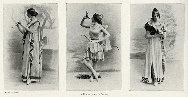
Another ingredient of Homar’s symbolism is the female figure, which as we already know has an essential place in Modernisme, considered an extension of nature. The relaxed appearance of the woman draped in flowing robes (see images) represents an aesthetic model that pinpoints the historical moment in which it was created. We should remember the influence on fashion of the Parisian couturier Paul Poiret (fig. 12), who freed women from the corset, covering them in designs inspired by the oriental world (figs. 10, 11). On the other hand, the treatment of the ladies’ hairstyles transports us to the Belle Époque in Paris, where the Parisian dancer Cléo de Mérode (fig.9) decorated her hair with ribbons (fig. 3). We also see scenes that take us close to the utopian panoramas of the post-Impressionist Paul Gauguin, who in his search for the primitive, travelled to Polynesia to draw the beauty of indigenous women in their natural state.
- (fig. 10) Peggy Guggenheim wearing a Poiret’s design, 1924. Photo: Man Ray
- (fig. 11) A model wearing a Paul Poiret. Photo: Wikipedia
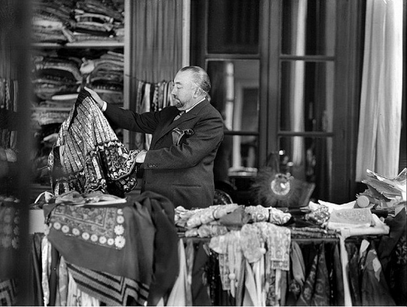
Within this experience immersed in Gaspar Homar’s inlay work, one detects his multi-disciplinary approach to the decorative arts. His association with textile production means that he treats it more sensitively than other artists. The realism he achieves enables us to perceive the subtle differences in its textures (figs.5, 6, 7, 8), which undoubtedly give it added value. In conclusion, the work of Gaspar Homar is one of the finest examples of Modernista art.
These days the reality of artisanal production is very different from how it was at the start of the twentieth century. Craftsmen still exist, but their numbers have dwindled. Technological change and the elimination of production costs have pushed out creators working like Gaspar Homar did. In fact, what is now understood as design is essentially functional, closer to the legacy left us by the functionalist currents of the industrial era. To some extent, as society has been moving towards the idea of comfort, it has been impossible to maintain the idea of the craftsman as it was understood in the early twentieth century. However, the teamwork and the figure of the ensemblier that emerge in the projects designed for the middle classes draw a parallel with the figure of the interior designer.
* Kakemono (掛け物), in Japanese art, is an object that is hung on the wall, generally a painting or calligraphy. It is hung down vertically on a wall or inside a tokonoma. The support on which the work of art is done can be paper or silk.
Catalan Modernisme
MERCÈ RODRÍGUEZ RENALES
In the second half of the nineteenth century, Barcelona experienced spectacular urban and industrial – and therefore economic – development, with the growth of the new industrial bourgeoisie, which had high purchasing power and wide-ranging cultural interests.
The Universal Exhibition of 1888 had urbanistic and architectural consequences, but it also led to a cultural transformation thanks to the Renaixença. This literary movement, aimed at the rebirth of the Catalan language and the reassessment and revival of the country’s history, gradually imposed itself as a cultural movement influencing all areas of artistic expression, especially architecture and the applied arts.
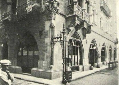
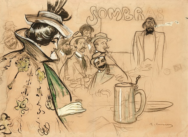
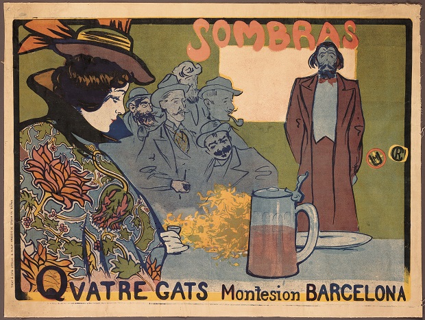
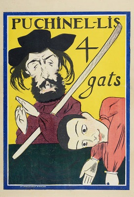
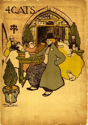
It is impossible to understand this period without the legendary tavern Els quatre gats, owned by the painter Pere Romeu, which opened in 1897 in the ground floor of Casa Martí, a Neo-Gothic building by the architect Josep Puig i Cadafalch
This place became a select club for intellectuals and artists, among whom we find an important group of outstanding Modernista painters including, among others, Ramon Casas, Santiago Rusiñol, Joaquim Sunyer, Hermenegildo Anglada Camarasa, Juan Brull, Ricard Canals, Javier Gosé, Josep Maria Sert and Miguel Utrillo. They were all highly influenced by, and connected to, the vanguard in Paris, and they gathered there to socialize and converse. Pablo Picasso, who put on his first solo exhibition of drawings and watercolours there in 1900, was one of the regulars.
Of all the artists I have mentioned I would like to talk especially about Ramon Casas.
Ramon Casas, Self-Portrait, 1908, Museu Nacional d’Art de Catalunya i Júlia, 1908, Privat collection.
He was born into a wealthy family in Barcelona on 4 January 1866, and he died on 29 February 1932 of tuberculosis. He was a painter well known for his portraits, caricatures and paintings of the social, intellectual, financial and political elites of Barcelona, Madrid and Paris. As a graphic designer his posters and postcards helped to define the concept of Catalan Modernisme.
He lived in Paris, working as the correspondent of the journal L’Avenç (a journal specializing in culture and history), of which he was the co-founder, together with Jaume Masso.
In 1904, during a stay in Madrid, he did a series of caricatures of the elite and of painters like Joaquín Sorolla and Agustín Querol. It was in fact in Querol’s studio where he painted an equestrian portrait of King Alfonso XIII that was purchased by the American collector Charles Deering, who later became his patron and commissioned many works of art from him.
Due to his increasing fame as a portrait artist, Casas moved back to Barcelona. He frequented the tertúlias at Maison Dorée, where he met Julia Peraire, a lottery seller 20 years younger than him.
He painted her for the first time in 1906 when Julia was 18 years old. She soon became his favourite model and his mistress, and with her he established the only stable relationship that we know of. Despite the fact that his family did not approve of this relationship they were eventually married in 1922.
While his career as a painter prospered, Casas began working in graphic design.
POSTERS
We must remember that posters, like any advertising material, have to produce the desired effect due to the simple fact that they must be seen, hence the effort and the creativity of draughtsmen and designers to achieve a striking and direct design. One of the characteristics of poster making, and which the pieces here exemplify to perfection, is based on being more striking to look at than to read, with the fundamental objective of attracting attention.
For many artists, designing posters was a pathway to creativity that, moreover, gave them the chance to make themselves known to the general public.
Posters were normally
very large, and due precisely to this, posters were divided into parts. This is
because they were designed to be pasted on the walls of big cities, something
that is still done today, for the purpose of making them visible from a long
way away. For this reason many posters were printed already divided into
sections, which once they had been stuck on the wall formed the whole work. Another
reason that explains the large size of some of these posters is the very raison
d’être of advertising: being highly visible and thus attracting people’s
attention.
His style evolved from post-Impressionism, influenced by painters like Manet or Degas, to a markedly realist style, using bright colours since the objective is to attract attention to the works.
In 1897 Casas and one of the masters of poster making, Miguel Utrillo, made their first poster, Ombres Xineses for Els Quatre Gats
After this experience he began his solo career creating advertising posters. He remained loyal to Els quatre gats, designing the tavern’s posters.
But he also began to design posters for other companies such as:
Codorniu In September 1898 the second poster-designing competition organized by private industry was announced: it was held by don Manuel Raventós to advertise his champagne Codorníu. The Poster Competition and Exhibition was looking for elegant and effective advertising. Ramón Casas was adjudged the winner
Anís del Mono The factory owner Vicente Bosch has gone down in history for having been a pioneer in the use of design to make advertisements and create a brand image. They have gone on to be part of the anthology of universal poster making, and are given pride of place in every handbook and study on the subject.
Anís del Mono (Con una falda de percal planchá) (In a pressed percale skirt) and Anís del Mono (Mono y mona)
Personally, it would be impossible for me to only show these two works (Codorniu and Anís del mono), since the richness of his work and the broad and varied themes of his posters offer a beauty and splendour visible in each and every brushstroke. Here I present a small sample of other advertising posters by the Catalan artist:
- 1897: Modas de Apolonia Castañeda
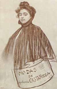
- 1898: M. Fvster. Fabricación de silicatos, Atelier Casas & Utrillo, Transparentes y Objetos Artísticos.
- 1899: Renaud Germain. Perfumería Fina y Jabones.
- 1900: Sífilis.


- 1901: Auto-Garage Central. Consejo Ciento.
- 1902: Antiquarum Artium Barcelonensis, Hojas Selectas. Revista para todos and Enciclopedia Universal Ilustrada J. Espasa.
- 1904: Agencia de Inquilanato.
- 1905: Champagne Kola and Jabón Fluido Gorgot.
- 1908: Jocs Florals de Barcelona. Festes del cinquantenari and Copa Catalunya Carrera Internacional de «Voiturettes».
- 1910: Vino Rioja Fino Rubí.


- 1916: L’auca del Senyor Esteve (a play by Santiago Rusiñol put on at the Teatro Victoria).
- 1929: La tuberculosi amenaça la vida i riquesa de Catalunya (in 1886, he had in fact survived this disease).
- 1937: Ajut Infantil de Reraguarda. Espera els vostres donatius.
And without specific dates
- Aperitivo Rossi.
- Real Club del Automóvil.
- Cigarrillos Paris.


Ramón Casas uses images of women with exquisite sensibility, and they are the protagonists of the great majority of his works. With them he created his great hallmark of identity.
He depicts them highlighting their femininity, delicacy and above all their great sensual beauty. He occasionally takes the venerated Greek goddesses as a source of inspiration.
Ramón Casas possesses one of the most beautiful poster collections.
Jujol, the enfant terrible!
ADOLFO LLORET ESCRIVÀ
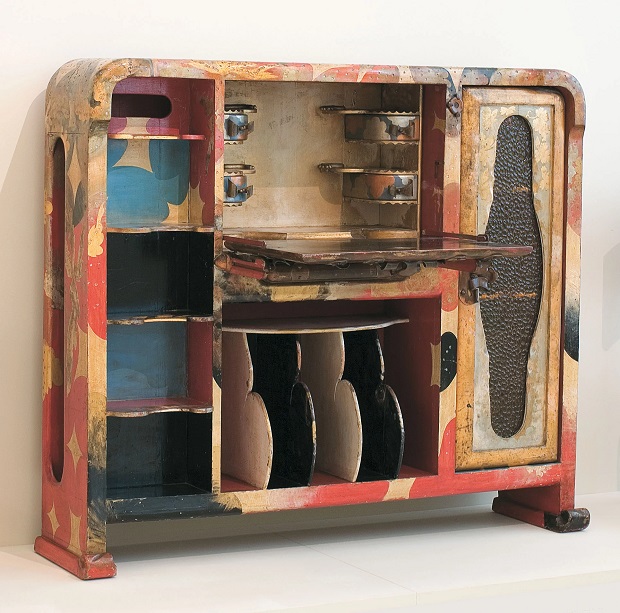
From the Museu Nacional d’Art de Catalunya’s permanent collection of Modern Art, the piece of furniture that I would point to is the desk for filing musical scores by the Modernista architect, draughtsman, designer and painter Josep Maria Jujol.
An all-round artist
Josep Maria Jujol i Gibert (Tarragona, 1879 – Barcelona, 1949) was the municipal architect of Sant Joan Despí and a professor at the Barcelona School of Architecture. He was also an excellent watercolour artist and a draughtsman who captured and created all kinds of objects and complementary elements such as furniture, lights and lifts. This aspect, together with his mastery of the use of colours, makes his work stand out, and it is often found complementing the work of other architects. His best-known collaborations were in Gaudí’s buildings and works: Casa Batlló, Casa Milà, Park Güell and Palma Cathedral. Jujol and Pere Mañach
Jujol and Pere Mañach
Pere Mañach was the heir to a family of Barcelona industrialists. With a great intuition for detecting new talent among young painters, he supported young Catalan artists (he was Picasso’s first dealer).
Upon the death of his father (1866) he had to take over running the family business, dedicated to manufacturing padlocks, safes and items of locksmithery. The business prospered and so in 1911 Pere Mañach opened his provocative new shop. On Gaudí’s recommendation, Josep Maria Jujol was given the job of designing the shop front and interior.
With a profoundly religious iconographic programme praising the Virgin Mary, Jujol wished to distance himself from the conventional look of a commercial establishment typical of the period, and he expressed his unquestionable creative ability with solutions close to Surrealism. Ceilings whose beams were not inserted in the walls and with plaster volumes imitating the cloak of the Virgin Mary. The colours were applied as “sauces that are mixed and rockets that explode” in the words of Jujol. Continuing with this organic concept Jujol designed items of furniture such as the chairs in the form of a bleeding heart expressing the mystic potential of the concept.
- Interior of Casa Mañach el 1911. Photo: Arxiu Històric del Col·legi d’Arquitectes de Catalunya.
- Chairs in the form of a bleeding heart (one of them is a replica) designed for Casa Mañach in 1911 and belonging to a private collection. Bedmar Fotografia.
A desk for filing musical scores
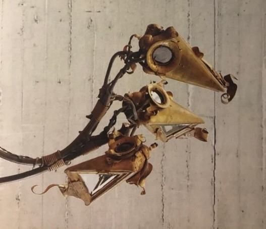
From this professional relationship there emerged a very fruitful friendship. We find another example in the workshops in Gràcia, from which a light, original and disconcerting, survives, with coloured glass and three heads that seem to have emerged from a seabed imagined by Jules Verne.
And finally we come to our main item of furniture, part of a set made in about 1919 for the private residence of Pere Mañach and Josefa Ochoa, in Ronda de Sant Pere, on the occasion of their wedding.
In this case Jujol uses a lacquering procedure that, unlike the subtle, refined, centuries-old Japanese urushi technique, is the result of an amalgam of materials: glue, lacquer and varnishes. He often worked using a mixed bag of objects that came from the world around him, which we could often describe as “recycled”: in this case exotic woods give way to pine wood, a material barely used by cabinetmakers. The ornamental features of the piece are also made from simple, deceptive ideas: spirals covered in copper sheeting, copper handles and ornaments with twisting shapes like scrolls, glass with the texture of drops of water and multiple round incisions on the surface. The result is an obvious creative ambiguity, halfway between painting, design and craftsmanship.
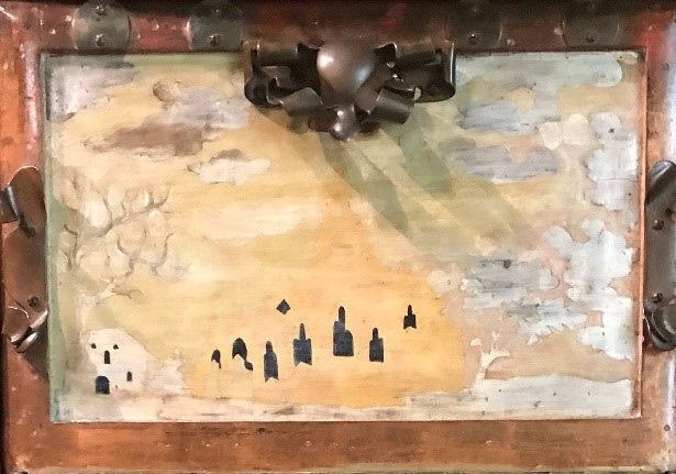
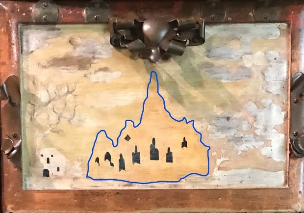
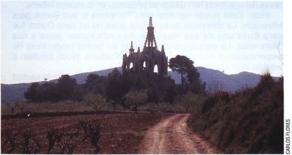
We must not forget that this desk, despite being an object with a utilitarian purpose, suggests and sublimates the artist’s spiritual and religious world. Of these religious icons the silhouette of the church of Vistabella stands out, painted on the central door panel, which simulates the outline of the mountain of Montserrat.
Details of Desk for filing music scores, 1919-1925. Photos: Adolfo Lloret
Transcendence
Did this desk influence later designers? In the recent history of furniture we find pieces that have similar connotations because their designers have had, or have, an innovative and transgressive nature that they share with Jujol. These items of furniture were also initially frowned upon by the critics of the day and have since become reappraised “classics”.
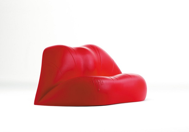
- This is the case of, for example, the Dalilips sofa by Salvador Dalí and Oscar Tusquets, designed in 1972 for the Mae West lounge in the theatre-museum in Figueres, monochrome but bold and striking.
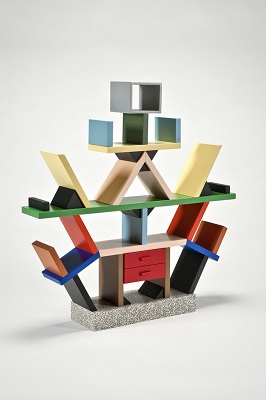
- A decade later came the Carlton set of shelves (1981) by Ettore Sottsass (Memphis Group), naïf looking but unique, with a colour scheme similar to Jujol’s desk.
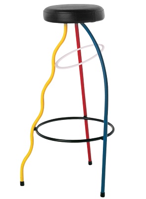
- Coincidentally, in Valencia, a year earlier (1980), Xavier Mariscal, with his audacious and singular artistic language, together with Fernando Salas, designed the Dúplex stool, with its asymmetric but functional different-coloured legs.
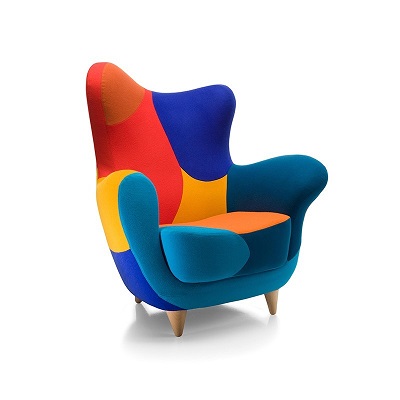
- Also by Mariscal, but 15 years later (1995), the Alessandra armchair is part of a collection of furniture called “Amorous Furniture”. It has some aesthetic similarities with regard to the Dúplex stool.
Recommendations
This year marks the 140th anniversary of the birth of Josep Maria Jujol and 70 years since his death, and the local council of Sant Joan Despí, where Jujol has a large number of works and where he was the municipal architect, as mentioned earlier, has organized an event called L’any Jujol140 (Jujol’s 140th anniversary), to shed light on the architect’s life and work. The activities will last until September and can be consulted on the website www.jujol140.cat/en/
For more interesting information about the work of Jujol I leave you this link to a documentary produced in 2002 in which his son, colleagues and students, among others, supply relevant information about this first-rate artist.
«But already as a young child he was entranced by the sunsets in Tarragona, with the red clouds that changed colour», Josep Maria Jujol junior remembers the architect’s mysterious creative potential.


