Núria Oriols
We continue our visit to the museum’s rooms that we began in last week’s article.
Renaissance and Baroque art rooms
Preparations with clays
As we move into a new room, we observe another change in the type of format. In the different sections of this period the majority of paintings are on canvas. In the palaces of the period, with walls filled with works of art, it was necessary to find a way of reducing the weight of the paintings. Replacing wooden supports with canvas ones was the first step in this direction. Nevertheless, the plaster traditionally used for the preparatory layer was still too dense. For this reason, the different workshops of schools and painters, located in particular geographical areas, began investigating and trying out new, lighter materials, using above all clays or earth from the surrounding area. This practice means that the chemical composition of preparations in this period has become a sort of identity code related to the provenance of the works. A preparation from Seville is nothing like one from Madrid, for example, in terms of composition and colour.
As aluminosilicates, clays contain an important proportion of silicon and aluminium, elements present in abundance, therefore, in the preparations of the canvases painted by Ribera, Velázquez, Ribalta, Van der Hamen, Maíno and Goya, among others. In the preparations one also detects minor elements such as calcium, potassium or iron, the latter responsible for the characteristic reddish colour of Baroque preparations. If manganese (Mn) is present in it, as has been detected in the preparatory layer of the work Still life with basket of plums and melon piece, by Zurbarán, then the colour of the clays is almost black. But let’s get back to the colours.

From ultramarine to cobalt blue
We normally associate the name cobalt (Co) with blue. Cobalt blue as used by contemporary artists dates back to the late seventeenth century, when Jean Antoine Chaptal, a minister – and chemist − in the French government, asked Louis Jacques Thénard and Jean-François Léonor Merimée to do research in order to improve the pigments in use up to then. From what he had observed in the manufacturing of porcelain in Sèvres, Thénard experimented with mixtures of cobalt arsenate, cobalt phosphate and aluminium oxide, heating them until he managed to obtain a new pigment, which was called cobalt blue. He published these results in the Journal des mines in 1803-1804, with the title «Sur les couleurs, suivies d’un procédé pour préparer une couleur bleue aussi belle que l’outremer». Throughout the entire history of art the blue of the semi-precious stone lapis lazuli has been especially appreciated; it was also called ultramarine, because the Italians imported it from overseas, from mines in what is now Afghanistan. Cobalt blue, however, did not manage to replace it completely, because years later, also in France, the Société d’Encouragement pour l’Industrie Nationale offered a prize of 6,000 francs to whoever could come up with a way of manufacturing artificial ultramarine blue that did not exceed 300 francs per kilogramme. Jean Baptiste Guimet won the competition on 4 February 1828, and from then on the high cost of lapis lazuli ceased to be an impediment for obtaining its characteristic colour.
Throughout the history of art, blue has always been a particular colour, appreciated, but hard to obtain, due to the scant availability of natural substances that present it permanently. Although scarce in nature, cobalt is contained in some minerals. Cobalt oxide has been incorporated into the manufacture of materials at different times in the history of ancient and modern civilizations, giving glass, enamels and ceramics a deep blue colour. In this context, it is easy to understand why the step was taken from crushing blue glass in order to use the powder obtained to paint with. This is the case with the pigment known as blue enamel, a potassium glass that contains cobalt, used particularly in painting from the sixteenth to the eighteenth century.
El blau esmalt
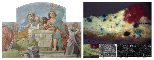
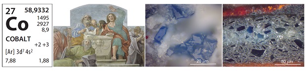
Annibale Carracci (1560-1609) used blue enamel in the skies of the mural paintings in the The Herrera Chapel. Church of San Giacomo degli Spagnoli in Rome, commissioned in 1602 by Juan Enríquez de Herrera, and which can now be seen in room 36. We also find it in the sky in the work The Conversion of Saint Paul painted by Juan Bautista Maíno (1581-1649), but on this occasion its presence is not obvious. It is applied in a base layer, underneath the azurite, a pigment far more appreciated and expensive. It has also been identified in the layers underlying the blue azurite in the work King Wenceslaus IV Sentences Saint John of Nepomuk by Paolo de Matteis (1662-1728). During the restoration of this work, some fissures appearing only in the areas painted dark blue were observed, which must have been caused by the presence of blue enamel. Potassium glass is chemically less stable than sodium glass. When blue enamel is mixed with an agglutinant such as linseed oil, the fatty acids this contains are able to react with the potassium in the glass and form salts, potassium soaps. This chemical reactivity, on a microscopic scale, eventually brings about, at a macroscopic level, a change in the texture of the agglutinant, causing breakages that explain the fissures. At the same time, the absence of potassium in the structure of the glass determines that this is also affected and it becomes totally transparent. Therefore, blue enamel is a pigment with a rather unstable colour that tends to turn grey or even become clear. Some of the colours now present in paintings by El Greco, for example, can be explained by the alteration of this pigment. And in the polychrome sculpture Wilgefortis of 1689, recently restored and exhibited, at the same time as the bearded figure was identified with a Saint Liberata, it was discovered that its clothes, now a vague brownish colour, must originally have been blue: its polychromy is full of the elements silicon, potassium and cobalt.


- Annibale Carracci, Mural Paintings from the Herrera Chapel, 1604-1606
- Juan Bautista Maíno, The Conversion of Saint Paul, circa 1614
- Paolo de Matteis, King Wenceslaus IV Sentences Saint John of Nepomuk, 1710
- Andreu Sala, Wilgefortis, c. 1689
Modern Art rooms
New elements for a new palette
These rooms act as a showcase of chemical elements. In them we find virtually all those that have been mentioned already and others discovered much more recently, which were gradually introduced during the nineteenth century through pigments of chrome, barium, zinc and cadmium.
Chrome (Cr) was identified in 1790 by the French chemist Nicholas Louis Vauquelin, when analysing an orange-coloured mineral. He published the method of obtaining lead chromate in Annales de Chimie IXX in 1809. The name he gave the element, derived from the Greek chroma (colour), clearly shows one of its chemical characteristics, the formation of brightly coloured compounds. This quality was promptly taken advantage of by the pigments industry, which produced a whole range based on chrome, from yellow to orangey red. Throughout the nineteenth century, the chemical industry made new pigments and colorants available to artists, and this gave rise to a change in the way they related to colour. Art was gradually moving towards abandoning the naturalistic use of colour, facilitating, together with other factors, the path to abstraction.
In the early twentieth century, we find a group of painters, the Fauvistes, fascinated by the use of pure colour, just as it came out of the tube, led by Matisse. This movement may well have been the most notable success of the advances made in pigment technology in the nineteenthcentury. Of the artists featured in the museum, Ismael Smith uses colours in a very similar way, while others, such as Isidre Nonell, prefer to mix pigments in order to obtain far more blended colours.
In the visit to the Modern Art rooms, we cannot forget silver (Ag), an element that is represented, above all, by photography. And we must also mention titanium (Ti), an element whose presence increased as the number of post-war and avant-garde artworks increased, very probably painted using titanium white.
Arsenic in the greens
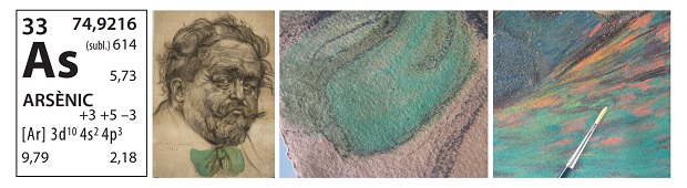
We have left this toxic element until the end; although it has been very common in yellows throughout the history of art in the form of arsenic sulphide – known as orpiment – in modern works of art it is present in the greens. In Ismael Smith’s work, in which green plays a prominent part, we find it used especially in the early works, the green bowtie in the Portrait of Isaac Albéniz, for example, painted with a pastel that contains copper acetoarsenite, otherwise known as Schweinfurt green, related by composition to Scheele’s green. In 1775, the chemist Carl Wilhelm Scheele synthesized this compound almost by accident. It was very cheap to produce, and this very quickly led to it being introduced as a multiuse pigment. This brilliant green immediately became the colour of fashionable gowns in Paris and wallpaper in the houses of Victorian England, although people were unaware of its toxicity. Health problems soon appeared however. There is even speculation that it was responsible for the death of Napoleon Bonaparte. Legends aside, what is true is that the properties of this compound made it especially suitable for use as a biocide. Here at the museum, we can testify to its effectiveness, because in some pastel drawings that have arrived in the restoration workshop from private collections, in which fungi were detected, the areas painted with this pigment remained intact, as if they had a protective barrier created by the arsenic.

At the end of this brief visit, we have clearly seen that the paintings on display have many small stories to tell, whose protagonists are the chemical elements.
The need for chemistry at the museum has become obvious, because when we study the material nature of the works in order to discern what the chemical elements introduced by artists in the past have to say today, a substantial amount of information is generated.
Related links
Future Exhibitions. Carracci. The Herrera Chapel
2019. International Year of the Periodic Table of the Chemical Elements
100 curiosities on the periodic table and the chemical elements
Restauració i Conservació Preventiva