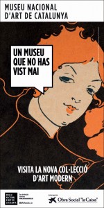
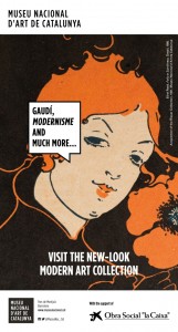
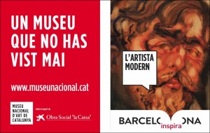
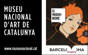
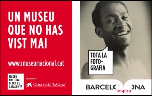
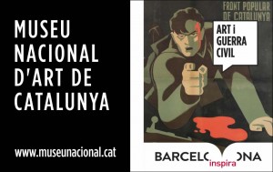
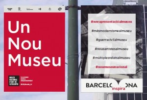
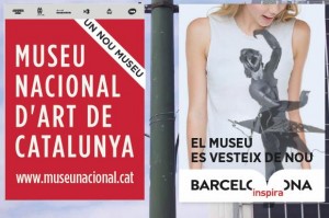
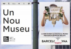
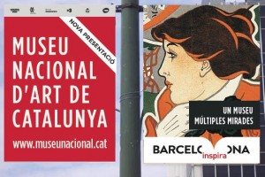
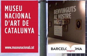
Do you recognise this poster? Have you seen on a shop window while walking around the centre of Barcelona, Terrassa or Granollers? Or perhaps you’ve seen the advertisement published in the press? Did it catch your attention to the extent that you wanted to find out more or to go to the museum? If you answer in the affirmative, and we would appreciate it if at the end of the post you could leave your comment, this will mean that the image of the campaign of the new presentation of Modern Art has got it right.
The communication campaign isn’t a magic wand but it has powers
Since we inaugurated the new presentation on 24th September, the number of visitors has increased by 56% in relation to the same period last year. It is, without doubt, very good news because we are convinced that our strength as a museum is given to us by the public.
There is no better advertisement than the “product” itself and the key to success of the new presentation of Modern Art is in the project itself: a groundbreaking museographic proposal, that gets away from the classic chronological ordering of the works to explain multiple stories that make up the history of the birth of Modernity in Barcelona and Catalonia. The proposal has been very well received by the public and the media.
However, in the Communication Department we like to think that it has something to do with the campaign. The fact of choosing an image, a claim or a slogan, all in all, choosing one specific creative concept and not another, are key to obtaining a greater notoriety and possible impacts among an audience bombarded on a daily basis by hundreds of advertising messages.
The briefing and a good creative agency: the perfect binomial
So, how was the process until reaching the campaign image? Intense but very enriching professionally. A path that we followed with an authentic teamwork: the communication staff and the agency Petit Comitè – with whom we had done the campaign for the exhibition The museum explores – , and also the chief curatorand the director of the Museu Nacional. All contributions summed together.
From the outset we knew that the project had many strengths to communicate but we needed to manage, more than ever, to focus the message. It often happens that in the moment of starting to work on a campaign various items are put forward to be communicated. But this time, the challenge was especially complicated: we had many new things to explain and we ran the risk of either over-simplifying, or overloading it with information.
It wasn’t only the fact of being a new presentation at a formal level but the fact that we had conceived a new museographic discourse, unpublished works and authors were to be exhibited, new artistic disciplines, in fact, a different way of understanding the collection had been materialised. And if that wasn’t enough, it was a unique opportunity to “communicate the museum”, so as to situate the Museu Nacional d’Art de Catalunya in the minds of the public as the cultural institution of reference it should be.
So to make sure the briefing was clear, we had various meetings with the agency and together we visited the new galleries when they were still full of workers, cables and artworks leaned against the walls.
There were two key ideas of the ideologists of the Project. For the director, Pepe Serra, the new collection of Modern Art “is not a new collection but a new museum” while Juanjo Lahuerta, chief curator, highlighted the fact that “with this new presentation we make the collection speak given that the works dialogue between them”.
From here the creative proposal chosen was born, which we deployed on the street banners by means of a sequence of 4 images: the works of art talk as if they were characters from a comic (searching for a more contemporary communicative code), and they explain the thematic fields of the new presentation, in which the photography and poster art are exhibited at the same level as paintings or sculptures.
But this wasn’t the only proposal that the agency elaborated. It’s not usual that a creative team presents up to 6 different proposals, and we would like to take advantage of this post to publicly thank them. See them all here as follows:
And it happens even less often that all the proposals presented matched the communication goals fixed in the briefing. So much so that we don’t rule out using one or two of them in future communications.
And you, which of all the proposals would you have chosen? We would like to know your opinion, either about the campaign or about the new presentation, if you have visited it.Related links
Making-of of the new Modern Art presentation (video 1’50 min.)
Petit Comitè agency
Comunicació

